Moodboard One: Fantasy/Sci-Fi Focus on muted natural colours, lots of green, brown, cream etc, but also pops of colour such as orange and red. Feels naturalistic and immersive- doesn't distract. Moodboard Two: 20th Century Period Dramas Focus on replicating the feel of a place and time, costumes and settings that work together,. some clashing and some highlighting one or the other to grab the audience's attention. Overall, I like the use of muted, natural colours, combined with pops of colour and/or light to draw attention to the intended focal point.
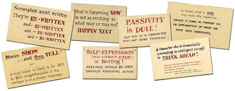
In one of our earlier Fiction Storytellers seminar, I was introduced to Alexander Mackendrick's Writer's Cards. These cards express his thoughts on filmmaking, story, directing and more. Below are some of the ones that stood out to me the most (in no particular order): "Props: are the director's key to the design of incidental business': unspoken suggestions for behaviour that can prevent 'theatricality'." I feel this sums up why I enjoy mise-en-scene so much and shows where the settings is as much a character as anything else. It's a way to provide depth without exposition. "If it can be cut out, then cut it out. Everything non-essential that you can eliminate strengthens what's left." This I find is something that comes with experience. When I think back to past films I've done, I could quite easily re-cut the footage to be half the run time. Perhaps this is due to time, and being more distanced to the project so it is easier ...


Comments
Post a Comment